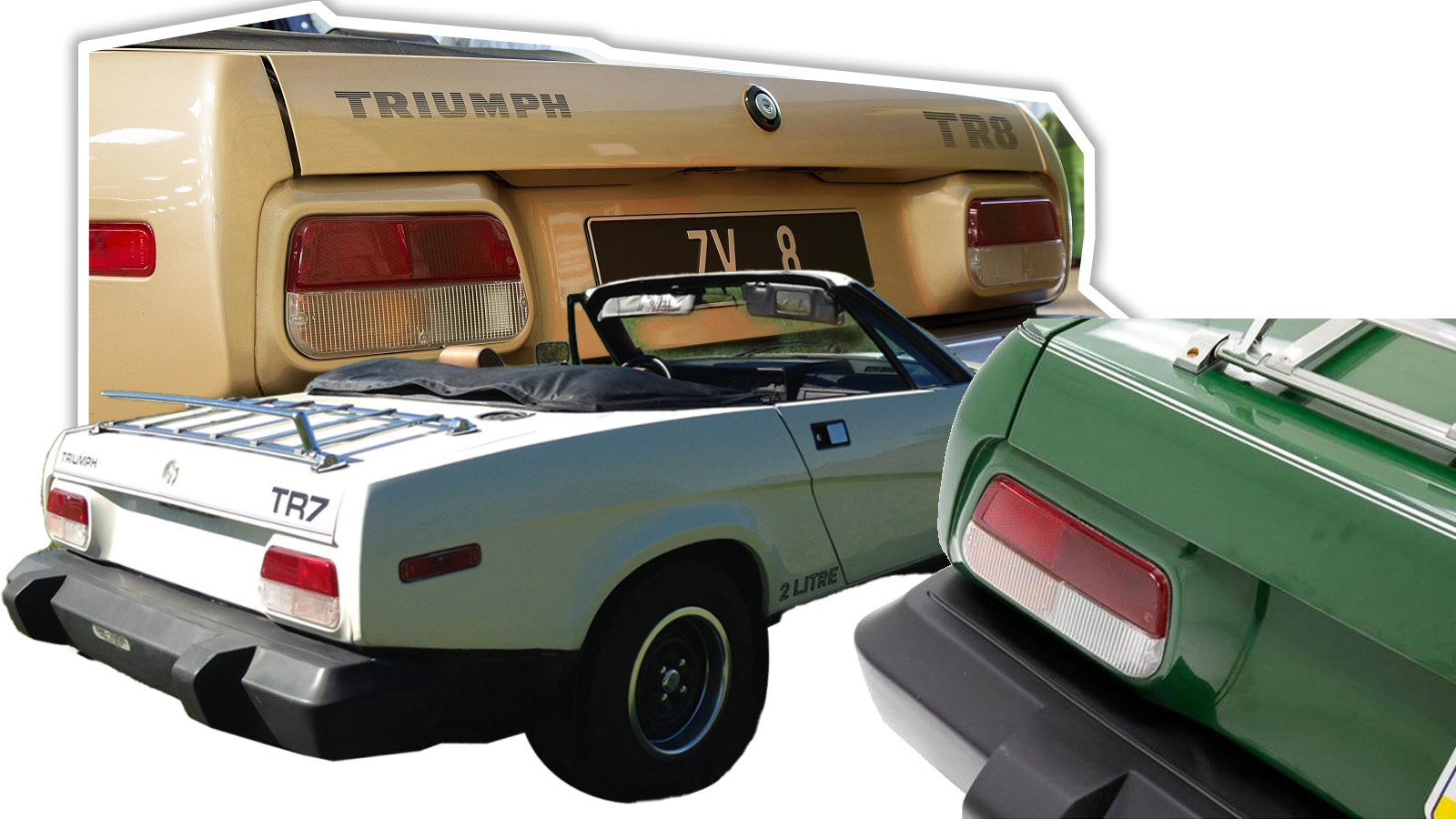
Now, I know what you’re thinking, mostly thanks to secret NSA satellites: “Torch, dollface, come on! The TR7’s taillights aren’t anything special! In fact, they’re kinda boring! So what are you getting at?” Well, hold on a minute, I’m going to explain. Let’s start by taking a moment to talk about the TR7 (well, and TR8, which used the same lights) and its approach to design.
British Leyland had a number of small sports cars competing in the same space between MG and Triumph, and Triumph needed something to replace the aging TR6. The end result was mechanically and technically pretty conventional, but sported some really dramatic wedge-shaped styling that was striking and controversial from the get-go. In a lot of ways the TR7 is seen as the archetype of ’70s wedge styling, of which there are plenty of other examples; there was even an MG-badged version, but that never came to be. Triumph really played up the wedge shape of the TR7, as you can see in this old commercial:
Damn, now I want a triangular television.
The Taillights
Most people today know the TR7 for its striking angular looks and the quality-control problems that plagued it, exaggerated or not. But I’m here to tell you that they should know it for its under-appreciated taillights, too. So let’s take a look at them:
Okay, so we have a pretty straightforward mid-to-late 1970s taillight, overall. It’s flat, has a shape like an isosceles trapezoid (I just learned that name right now) with rounded corners, and is a Euro-style tri-color lamp with amber rear indicators. It’s the indicators that I want to talk about. The pictures up there show the indicator on and off. Left is off, right is on, and you may notice that the amber section is pretty muted when off. That’s because the lens itself isn’t amber at all; it relies on an amber bulb to produce the citrusy color of an indicated turn, as you can see by looking at the lens itself:
Now, while this clear-lens-amber-bulb method had been used for front indicators since at least the early 1960s, as you can see on this Peugeot:
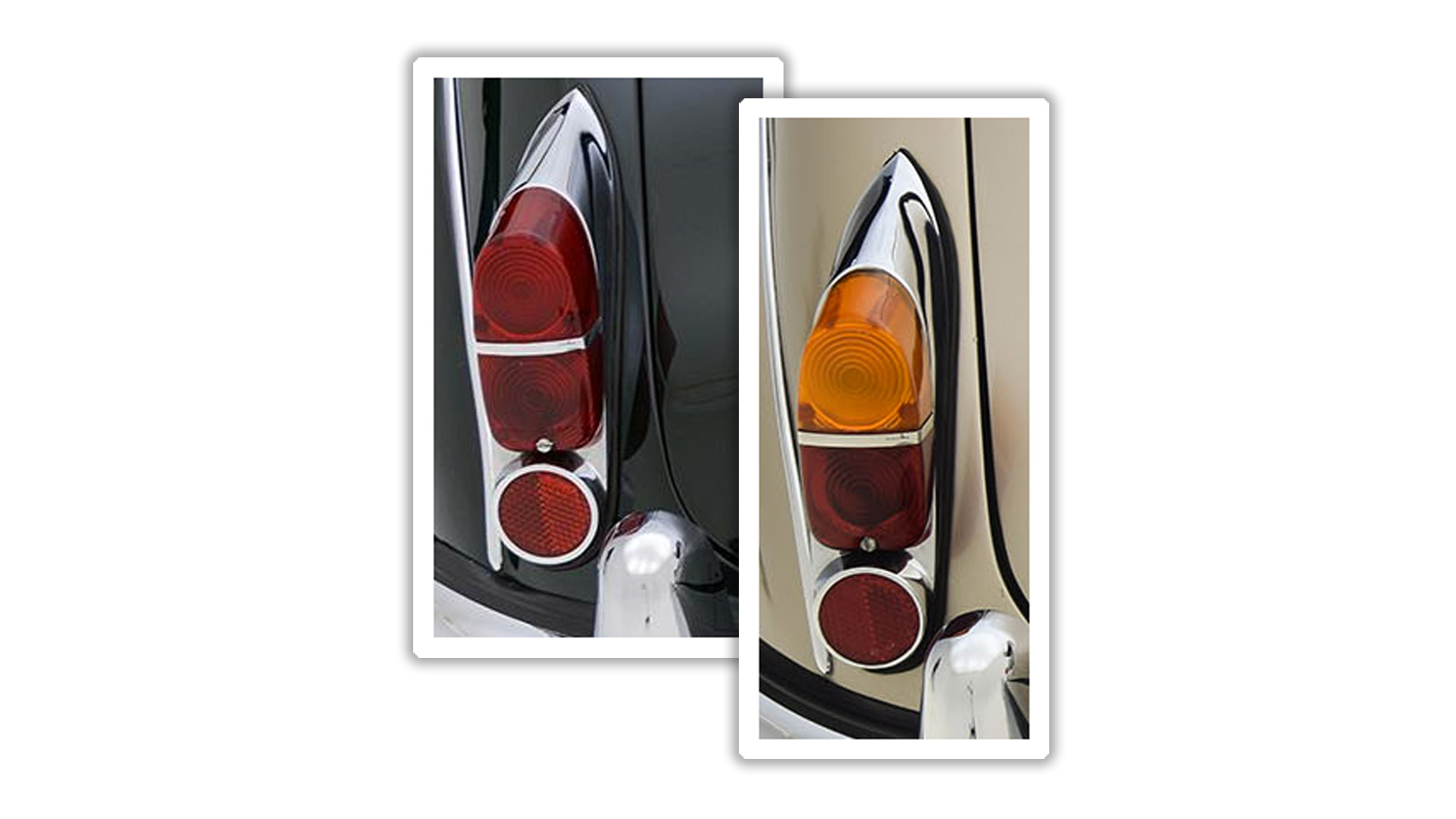
…at the rear, I do not believe this solution was tried until the TR7, despite amber rear indicators being required in Europe since the early 1960s. Most carmakers simply took the straightforward and expected route and used vivid, bold, unashamed amber lenses, as you can see on these Jaguar Mk2 taillights:
While I’m fond of the bright amber lenses on most cars, I will admit that there can be an appeal to the more subtle look achieved by the TR7’s novel taillight design. I’ve been trying to find an earlier example of the clear-lens-amber-bulb at rear on some other decent-volume production car prior to the TR7, and I really haven’t come up with anything. I think this was a genuinely pioneering moment in taillight design, and I still think its influence has never been properly acknowledged.
Some have pointed out in the comments that the amber is not from an amber bulb, but an inner amber lens, as you can see here:
— Robin Marriott (@RobinMarriott) December 8, 2022 I’ve seen pure clear lenses and these type, but, really both accomplish the same end result: mute the amber look of the indicator. So, sure, there is an inner amber lens but there’s a reason it’s inside, behind the clear lens, and that’s to downplay the amber color when not illuminated. So, commenters, yes, you’re correct, but the main point still stands.
Car Designers Sure Do Have Opinions
So, why do I say this? Why do I think that the TR7’s lights haven’t gotten the credit they deserve? The answer has to do with car designers. Based on conversations with a number of designers, including our own Adrian Clarke, car designers in general seem to hate having to deal with amber rear indicators, because they resent the need to incorporate yet another color into the rear end graphical look formed by the lighting design. In America, you can have taillights that avoid amber rear indicators, and even though studies show red rear indicators are significantly less safe, designers will still create red-indicator designs, because, I suppose, the lack of safety is less important than the cleaner look of a more monochrome taillight design. Designers are absolute bitches about this sort of thing! They’re not kidding around, here. Ask one to stick a couple of dollops of orange onto the stunning rear end design they just made with a simple long red slash of a rear light signature and you’re likely to get a face full of gin and tonic. But, the TR7 shows another way. You see, what the TR7 light showed is that you could have the safety (and legally required, in most of the world) benefits of an amber rear indicator without the garishness of a bright amber lens by simply keeping the lens clear, and letting the bulb handle the chromatic work. Look at those TR7s up there; the amber is subtle, unassuming, and the graphic look of the taillight is really just a red bar over a slightly peach-tinted white bar.
The Influence
And, significantly, this approach is incredibly common today, possibly even more common now than a vivid amber rear lens is. So many cars from the 90s and up have used this method to keep their rear light graphic clean and bold, and if you go into any parking lot today I’m certain you’ll find cars that use this approach within ten steps of wherever the hell you parked, or less, because it’s very likely on your car, too.
And, with modern LED bulbs, it’s becoming even more common, since LEDs that can light red or amber exist, and can be placed under a clear lens, ready to illuminate in whatever color is needed. My point is that this wildly common lighting design approach was first seen on the quirky and oft-maligned Triumph TR7, and I almost never see that car getting any sort of recognition for this quiet taillight revolution it pioneered. I’m hoping one of you in the comments may know of an even earlier example, because that would be an exciting thing to find out; but even if one does come to, um, light, I still can’t think of a car you’d actually have been likely to see on the roads from the mid 1970s on that used this taillight approach other than the TR7. So take a moment to appreciate what the TR7’s taillight accomplished: it let fussy, petulant car designers get their simple rear light graphic looks they love so much without sacrificing the safety of an amber rear indicator. It’s possible, even if maybe unlikely, that the TR7’s bold taillight experiment actually saved lives as a result. That’s why the TR7 taillight is the Velvet Underground of taillights.
Read more on The Autopian
• Today’s Taillight: The Dream Of The Ombré/Gradient Taillights • Today’s Taillights: The Workhorses, The Ford And Chevy Truck Taillights Of The 1970s And 1980s Want to write for The Autopian? Pitch us here. Or check out the stories on our homepage.


